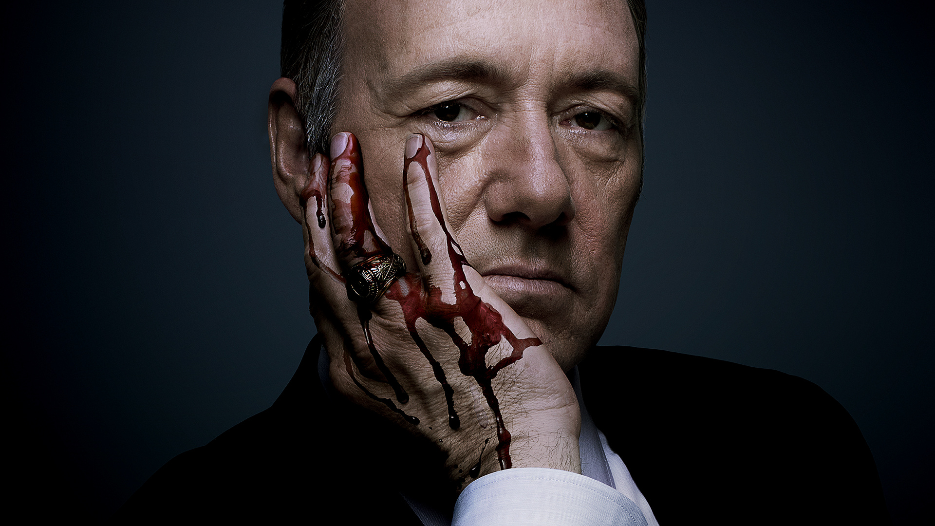
One of the best things about the hit Netflix show House Of Cards is that it established it’s Visual Formula very early on, sticking with it throughout each of the show’s successive seasons. Now a video showcasing that style is making the rounds on the internet. While I find the assessment in the video to be for the most part spot on, the “analysis” becomes too simple and misguided for my taste. Here is the video:
[su_youtube_advanced url=”http://youtu.be/SuRXobQYVaU”]The title itself is completely misguiding, as the claim that “Every shot in House of Cards is the same” is way too broad to begin with. Shots are composed of many elements, but what this video is really discussing is how elements of shots help to create an overall visual style. In particualr, the video on The Visual Formula of House of Cards seems to focus on the element of color temperature and how they use conflicting color temperatures within the same shot to tell the story. The opposition of characters is an idea that is very conducive to the nature of the show, it shows this conflict visually by having certain characters in colder parts of the frame, while others are in warmer parts of the frame. The interesting part about this video is that you really can’t un-see this once it is pointed out by the video.
House of Cards Season 3 is currently streaming on Netflix.